Website Examples
Coffee shop website examples
Updated
Here are 6 coffee shop websites you can open and click through. Some are quiet and plain. Some are loud and bright. All of them put the same few things where a person in a hurry can find them: when you open, what you pour, what it costs, and how to get to the door.
Every site on this page is a concept design. We made up the shops and built the websites to show our work. They are not real businesses and they are not our clients. Our real client work is on the client work page.
Coffee shops: 6 concept designs
 Concept design
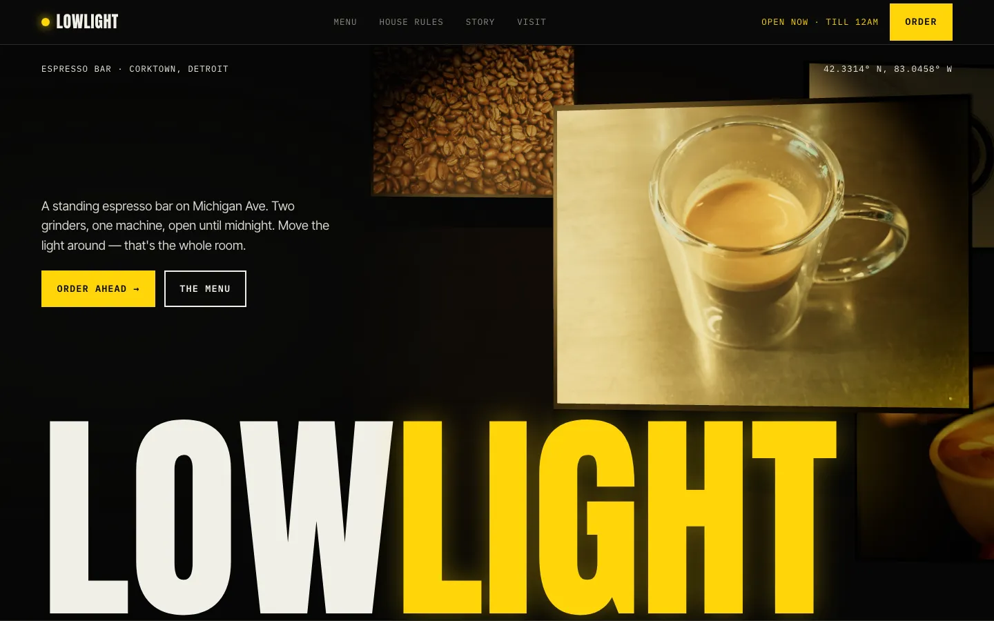
Lowlight Espresso
Late-night espresso bar, a made-up shop
- The top bar has an open-now line with the closing time, so nobody hunts for hours.
- The Order button is right beside that line.
- The menu is one short list with a price on each line.
 Concept design
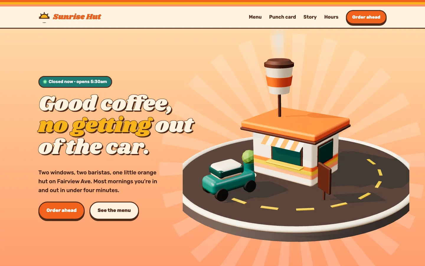
Sunrise Hut
Drive-thru coffee hut, a made-up shop
- A strip at the very top says the windows are open and until when.
- The price board shows three cup sizes side by side, like the sign at the window.
- Order ahead is a button in the top bar.
 Concept design
Margin Coffee
Specialty coffee bar, a made-up shop
- One small table holds the hours for each day, with the half day off called out.
- The menu is typed out in three short groups.
- The page has a map link and a phone number you can tap to call.
 Concept design
Marigold Coffee
Neighborhood coffee shop, a made-up shop
- You see the opening time right under the headline, before you scroll.
- Two buttons up top: See the Menu, and Hours & Location.
- A short menu with a price on every drink.
 Concept design
Workhorse Coffee + Larder
All-day café, a made-up shop
- Three menus on one page: morning, midday and evening.
- You can reserve a table from the top bar.
- Hours and location get their own link in the menu bar.
 Concept design
Persimmon Café
Brunch café, a made-up shop
- A waitlist form asks for a name, a phone number and party size. No app to download.
- Weekend hours show on the first screen.
- Each dish has a price and a short note under it.
These are concept designs for made-up shops, not client sites. Each card opens the full concept in a new tab.
What should a coffee shop website have?
A coffee shop website needs five things: your hours, your address, your menu with prices, a phone number, and a few real photos of the room and the drinks. Put the hours and the address on the first screen. Most people who land on your site are already on the way and want to know one thing: are you open.
Hours on the first screen
Not at the bottom. Not inside a picture. Write them as plain text near the top, and write the odd days too, like a holiday or a day you close early.
A menu you can read on a phone
Type the menu out as words on the page. A photo of the chalkboard or a PDF means pinching and zooming with one thumb while holding a dog leash.
Prices
People want to know if a latte is four dollars or seven before they walk over. A short list with a price on each line is enough.
One clear button
Pick the one thing you want people to do: order ahead, get directions, or see the menu. Put that button at the top and again at the bottom.
Real photos
Your counter, your cups, your people. Three good photos from a phone do more than twenty stock pictures of somebody else's latte.
What to look for in these coffee shop designs
Open two or three of the concepts on your phone, not your laptop. Count how many seconds it takes to find the hours. Look at how short the menus are. Notice that each page has one main button and uses it more than once. Then open your own site and run the same test.
Want to see real shops, not concepts? Look at the sites we built for Charlie's Coffee Shop and Local Ice, or see all client work.
Common questions
Want a site like this for your coffee shop?
Yours would not be one of these six. It starts from your own counter, your own cups and the menu you really pour. Sign up in about 5 minutes. Type your shop's name and see a free preview of your new site before you pay. No call needed.
Or see what each plan includes.